Learn how a script breakdown turns pages into a shootable plan. A practical guide to scheduling, budgeting, and avoiding costly production surprises on set.
09
Aug
2026

Learn how a script breakdown turns pages into a shootable plan. A practical guide to scheduling, budgeting, and avoiding costly production surprises on set.
Shot list vs storyboard: learn what each planning tool does, when to use which, and how to plan coverage so your scene actually cuts together in the edit.

Learn how to block a scene so actors and camera work together. Practical staging steps, a real example, and fixes for the most common blocking mistakes.

Learn how to plan scene coverage without over- or under-shooting. A director’s guide to choosing shots the editor can actually cut, with a practical checklist.
Casting is often treated as a footnote in discussions of filmmaking, overshadowed by directors and writers. Yet a single casting decision can make or break a film. The right actor in the right role feels inevitable in hindsight, as if no one else could have played the part. That inevitability is the casting director’s craft at work.
A casting director is not just hunting for famous names. They are matching a face, a voice, and a presence to a character that currently only exists on the page. Sometimes that means an unknown actor whose ordinariness makes a story feel real. Sometimes it means casting against type, putting a comedic actor in a dark role to unsettle the audience’s expectations. The goal is chemistry, not celebrity.
Ensemble films live or die on these smaller choices. A flat supporting performance can pull you out of a scene as quickly as a miscast lead. Great casting directors think about the whole cast as a single instrument, tuning each part so the group sounds right together rather than collecting a handful of impressive solos.
The next time a performance feels perfectly suited to its character, remember that someone saw that potential long before the cameras rolled, often during a brief audition in a bare room. Casting is a quiet art, invisible when it works and painfully obvious when it does not. It deserves far more credit than the closing scroll usually gives it.

Learn how to do a script breakdown: tag every element, build an accurate schedule, and avoid on-set surprises. A clear, practical guide for filmmakers.

A director’s guide to blocking a scene: how to stage actors and camera so movement carries meaning, plus common mistakes and a practical on-set checklist.

Watch a handful of modern blockbusters and you may notice a familiar look: warm orange skin tones set against cool blue and teal backgrounds. This is not an accident or a trend that happened by chance. It is a deliberate color grading choice, and once you see it, you cannot unsee it.
Human skin sits in the orange part of the spectrum. On the color wheel, the opposite of orange is blue. Placing complementary colors next to each other makes both pop, so pushing backgrounds toward teal makes actors stand out instantly. In a busy action scene with a lot happening on screen, this helps the audience keep their eyes locked on the people who matter.
Color grading used to be a chemical, painstaking process. Digital tools made it fast and precise, and the orange and teal combination became a default because it was easy, flattering, and reliable. That convenience is exactly why critics grew tired of it. When every poster and trailer shares the same palette, films start to blur together.
The best filmmakers treat color as storytelling rather than decoration. A movie drenched in sickly green or sunbaked gold is telling you something about its mood before a word is spoken. Pay attention to a film’s palette and you gain a small window into how much thought went into its world. Color is rarely neutral, and the films that resist the easy default usually have something to say.
Silence in a film is almost never silent. When a scene goes quiet, a sound designer has usually made a deliberate choice about what remains: a faint room tone, a distant hum, the breath of an actor. Pure digital silence is jarring and unnatural, so true absence is rarely what you hear. What you hear is controlled emptiness, shaped as carefully as any explosion.
Every space has its own background sound, known as room tone. A kitchen hums differently from a cathedral. Sound editors record minutes of this tone on set specifically so they can lay it under dialogue and quiet moments. Without it, cuts between lines would click and pop, and the world would feel hollow. The quietest scenes are often the most layered, just with everything pitched far below the threshold you consciously register.
Silence gets its power from contrast. A loud, busy soundscape that suddenly drops out can hit harder than any swell of music. Directors use this in war films, where the ringing aftermath of an explosion strips away sound to put us inside a character’s stunned head. Horror films lean on it too, stretching quiet until the audience leans forward, then breaking it.
The next time a film makes you hold your breath, notice that the silence is doing work. Someone decided exactly how empty that moment should feel and engineered it down to the last whisper of air. Quiet, handled well, is one of cinema’s loudest tools.

Understand the 180-degree rule so your coverage cuts together cleanly. Practical guide to the camera axis, screen direction, eyelines, mistakes, and fixes.

Learn how to turn a script into a shot list that a crew can actually shoot. A practical, step-by-step method with examples, mistakes to avoid, and a checklist.

Learn how to turn a script page into a working shot list, with a real breakdown example, coverage logic, common mistakes, and a director’s checklist.
A match cut is one of the quietest tricks in a filmmaker’s kit, and yet it can feel like magic when it lands. The idea is simple: you cut from one image to another that shares a shape, a movement, or a composition, so the two shots seem to rhyme. The most famous example is in 2001: A Space Odyssey, where a bone tossed into the air becomes a spacecraft drifting through orbit. One cut, and millions of years of human progress collapse into a single second.
Our eyes track continuity. When the next shot mirrors the position of the thing we were just looking at, the brain treats the two as connected even when the content is completely different. That lets a director suggest a relationship without spelling it out in dialogue. A spinning record can become a car wheel. A closing eye can become a setting sun. The audience does the linking work themselves, which makes the connection feel earned rather than handed to them.
Match cuts are powerful precisely because they are rare. Use them constantly and they become a gimmick; use them once at the right moment and they can compress an entire theme into a heartbeat. Next time a transition gives you a small jolt of recognition, pause and rewind. Chances are an editor lined up two images so carefully that you felt the meaning before you could name it. That invisible craft is a large part of why certain scenes stay with us for decades.
Continuity errors are cheaper to prevent than to fix. Learn what a script supervisor really does, how to track continuity, and mistakes that break the edit.

Blocking a scene turns dialogue into cinema. Learn how to move actors and camera with purpose, plus a real example, common mistakes, and a blocking checklist.

Learn a repeatable method to turn a script page into a working shot list, choose coverage wisely, and avoid the mistakes that waste your shoot day.
Great dialogue on the page can die on screen. Learn why it happens, how subtext and rhythm fix it, and the table-read test that exposes flat lines fast.
Continuity errors break the edit and pull viewers out of the story. Learn how to catch them on set, a real example, common mistakes, and a continuity checklist.
Theme is the idea a story is really about underneath its plot. It is the answer to the question, what is this film trying to say about the world? Many writers either ignore theme entirely or hammer it so hard that the audience feels lectured. The skill is to hold a clear idea in mind while letting the story carry it lightly.
Readers who want to dig deeper can find more at Congtyomic.
Plot is what happens; theme is why it matters. Take your premise and keep asking why until you reach something that is no longer about events at all. A story about a thief planning one last job might really be about whether people can change. That underlying question is your theme, and it should quietly shape every choice you make.
The strongest way to explore a theme is to give different characters different answers to it. One believes people can change; another is certain they cannot. By putting those beliefs in conflict, you dramatise the idea instead of stating it. The audience watches the argument play out in action rather than being told the conclusion.
When theme works, audiences leave with a feeling they may struggle to put into words. That is the goal. You are not writing an essay with a thesis statement; you are building an experience that leaves a question echoing. Hold your idea firmly, then let the story say it for you. That restraint is what separates a film that moves people from one that merely informs them.

Writers spend so long talking about the page that the cutting room can feel like a foreign country. Yet editing is where a film is rewritten one last time, and understanding it will make you a sharper writer. Here are the questions about editing that come up most often, answered plainly.
Yes, often profoundly. An editor decides which take to use, how long to hold a moment and where to cut away. They can speed up a sluggish scene, soften a harsh one, or even reorder events. A film is found in the edit as much as it is written on the page.
Continuity is the consistency of details from one shot to the next: the level of a drink, the position of a hand, the light outside a window. When it slips, audiences feel that something is off even if they cannot name it. Good editors and continuity supervisors catch these breaks so the story stays seamless.
If editors regularly cut a certain kind of scene, write fewer of them. Trust your audience to follow without every explanation spelled out. Watching how films are assembled will quietly improve the scripts you write next.

New writers often ask whether they should be writing features or short films, treatments or full scripts, and how the formats differ once a project reaches production. The honest answer is that each format teaches you something the others cannot, so it helps to know what you are choosing between.
A short is the best place to learn. It is small enough to finish, cheap enough to make, and unforgiving enough to expose weak ideas quickly. Because every minute counts, shorts force you to write economically. Many directors built their reputations on a single strong short.
A feature gives you room to develop character and theme across an hour and a half or more. That space is a gift and a trap. The discipline that a short demands by its length must, in a feature, come from you. Sustaining tension across ninety pages is a different skill entirely.
There is no single right path. If you are starting out, a short will teach you the most for the least risk. When you have an idea that genuinely needs more room to breathe, the feature will be waiting. Choose the format that fits the story rather than forcing the story to fit a format you admire.

Before a camera rolls, before a single line of dialogue is spoken aloud on set, a director has to answer a question that sounds trivial and turns out to be enormous: where does each actor stand, and when do they move? The craft of answering that question is called blocking, and it is one of the least discussed but most decisive stages in the journey from script to screen. A scene that reads flat on the page can come alive because two people cross a room at the right moment. A scene that should sing can die because everyone is planted in a tidy semicircle, talking at each other like furniture.
Blocking is the choreography of bodies in space. The term comes from the theatre, where directors once pushed small wooden blocks around a model stage to plan where performers would move. In film it means the same thing with an added partner: the camera. On any given day, the director, the actors, and the cinematographer work out the physical shape of the scene, who sits, who stands, who approaches, who turns away, and how the lens travels to follow all of it. It is the moment where a written scene becomes a spatial event.
What makes it difficult is that blocking has to satisfy several masters at once. It must serve the emotional truth of the moment, respect the practical limits of the set, keep actors inside the light the gaffer has rigged, and give the editor enough distinct positions to cut between later. A move that feels natural for the actor might drag them into shadow or turn their back to the only camera angle that works. Good blocking hides all of that negotiation so the audience never suspects it happened.
Experienced directors talk about the geography of a scene, the invisible map of where power, comfort, and tension live in a space. A kitchen table has ends and sides, and where a character chooses to sit says something before they speak. A doorway is a threshold; a character who lingers in it is neither in nor out of the conversation, and that hesitation reads instantly. A window, a staircase, a long hallway, each gives the director a way to externalize what a character is feeling.
Consider a familiar example: a tense conversation between a manager and an employee. If the director blocks the manager seated behind a desk while the employee stands, the geometry does the storytelling on its own. Reverse it, put the manager on their feet while the employee sits comfortably, and the same dialogue carries a completely different balance of power. Nothing in the script changed. Only the arrangement of two bodies in a room.
The most useful thing a director can internalize is that movement should be motivated. Actors should not drift across a room simply because the scene has gone static and someone wants visual variety. When a character stands, walks to the window, and turns their back, that action ought to coincide with a shift in what they are thinking. The physical gesture becomes a punctuation mark for the internal one.
This is why blocking and subtext are inseparable. A line like “I’m fine” means one thing when spoken while stepping toward someone and another when spoken while retreating. Directors often withhold the emotional beat from the dialogue and place it in the movement instead. The audience feels the character pulling away even as the words insist that everything is normal. That gap between what is said and what the body does is where a great deal of screen acting actually lives.
On a film set, blocking is never decided by the actors alone. The camera has its own needs. A cinematographer wants clean compositions, room to move, and lighting that holds up as performers travel through the frame. There is a constant give and take. The director rehearses a move with the actors, the operator watches through the lens, and adjustments ripple back. Perhaps the actor’s cross is a foot too long and pulls them out of a key light. Perhaps two performers standing at the same height create a dull, symmetrical frame, so one is asked to lean on a counter to break the line.
This is why productions run a rehearsal on the day before shooting, often just the actors and a skeleton crew walking through the scene while the director and cinematographer watch. They are not perfecting the performance yet. They are finding the shape. Once the shape is set, marks are laid on the floor, small strips of tape the actors learn to hit without looking down, the lighting is finalized to those positions, and only then does real shooting begin.
Blocking choices also determine how a scene will be shot and cut together. A director who blocks a scene as one continuous flowing move may plan to capture it in a single unbroken take, letting the camera choreograph with the actors like a dance partner. That approach is thrilling when it works and unforgiving when it does not; one stumble near the end ruins the whole attempt. The alternative is coverage, shooting the same scene from multiple angles and sizes so the editor can assemble it afterward. Blocking for coverage means giving actors consistent, repeatable movement so a gesture made in the wide shot matches the same gesture in the closeup.
Neither approach is inherently superior. A long take can build unbearable tension because the audience senses there is no cut coming to relieve them. Coverage hands the storyteller precise control over rhythm and emphasis in the edit. What matters is that the blocking is designed with the intended shooting method in mind from the very start, because the two decisions cannot really be separated.
The strange reward of good blocking is that it disappears. When a scene feels effortless and alive, viewers credit the writing or the acting, rarely suspecting that the confrontation landed because one character was slowly backed into a corner of the frame over the course of the argument. That invisibility is the point. Blocking is not meant to be admired; it is meant to be felt. The next time a scene grips you without any obvious visual trickery, watch where people stand and when they move. The story is being told in their footsteps.
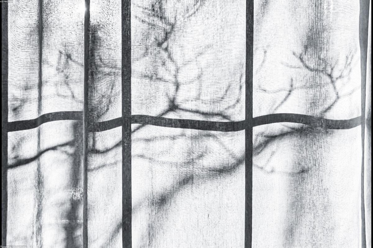
Two cameras can stand in exactly the same spot, pointed at exactly the same actor, and produce images that feel emotionally opposite. The difference is the lens. Long before color grading, music, or editing shape how a scene lands, the choice of focal length has already told the audience how to feel about the person on screen. It is one of the quietest decisions in filmmaking and one of the most powerful, and it happens on the far side of the camera where the audience never thinks to look.
Focal length, measured in millimeters, describes how much of the world a lens takes in and how it renders depth. A short focal length, say 18mm or 24mm, is a wide lens; it captures a broad view and exaggerates the sense of distance between near and far objects. A long focal length, 85mm, 135mm, or beyond, is a telephoto lens; it narrows the view and compresses space, making distant things feel stacked close together. Somewhere in the middle sits the so-called normal lens, around 50mm, which roughly approximates the perspective of human vision.
Those are the mechanics. The art lies in what each of these does to a face, a room, and a feeling.
A wide lens pulls the viewer into the space. Because it takes in so much and stretches the apparent distance between foreground and background, it makes a room feel larger, a landscape feel vaster, and any movement toward the camera feel dramatic and fast. Directors reach for wide lenses when they want the environment to matter as much as the person, when the world itself is part of the story.
Bring a wide lens close to a face, though, and something unsettling happens. The nose enlarges, the edges of the frame bow slightly, and the features distort. This can be used deliberately. A character in the grip of paranoia, a nightmare, or a drunken haze is often shot with a wide lens held uncomfortably close, so the audience feels the wrongness without being able to name it. The distortion is not a flaw; it is a feeling made visible.
The telephoto lens does the opposite. It compresses space, so the background seems to press in right behind the subject, and it renders that background as a soft, creamy blur when the aperture is open. A face shot on a long lens is flattering and clean, the features rendered without exaggeration, the person lifted out of their surroundings and set apart.
That separation carries meaning. A character shot on a long lens can feel isolated, observed, or emotionally unreachable, cut off from the world dissolving behind them. Filmmakers also use the telephoto’s compression to create a specific kind of tension: two people who are physically far apart can be made to look as if they are stacked one behind the other, sharing a frame they do not really share. The long lens is the tool of the watcher, the sniper, the eavesdropper, and, just as often, the lonely.
Between the two extremes lives the 50mm, the lens closest to how the human eye perceives perspective. It neither expands nor compresses; it simply shows. Some filmmakers commit to a normal lens for long stretches precisely because it refuses to editorialize. The image feels plain and truthful, and that plainness becomes its own statement in a medium full of visual persuasion. When nearly every shot in a film is made on a normal lens, the rare departure to something wider or longer arrives with real force.
The most sophisticated use of focal length treats it as a language rather than a technicality. A cinematographer might assign a particular lens to a particular character, shooting one person consistently on a wide lens and another on a long one, so that even in the same conversation the two people occupy visually different worlds. As a character’s situation changes, the lenses can change with them, moving from wide and exposed to long and isolated as the story tightens around them.
There is a physical truth underneath all of this that most viewers never consider. To keep a face the same size in the frame, a wide lens must sit close to the actor and a long lens must sit far away. That distance shapes the performance and the mood on set. A wide-lens closeup means the camera, and often the director, is right in the actor’s space, which can feel invasive and raw. A long-lens closeup lets the camera hide across the room, which can produce a quieter, more private performance because the actor feels less crowded. The audience never learns how far the camera stood, yet they feel the result in the texture of the emotion.
Picture a simple dinner argument between a couple. Shoot it on a wide lens and the whole apartment crowds in, the clutter on the table, the distance between two people at opposite ends, the space that separates them made painfully literal. Now shoot the identical scene on a long lens, and the room melts away into blur; the two faces float in isolation, each locked in a private sorrow, the shared space erased. The words are the same. The blocking is the same. Only the glass in front of the sensor has changed, and yet the meaning of the scene has quietly shifted from a story about distance to a story about loneliness. That is the power a lens holds before anyone on screen has said a word.
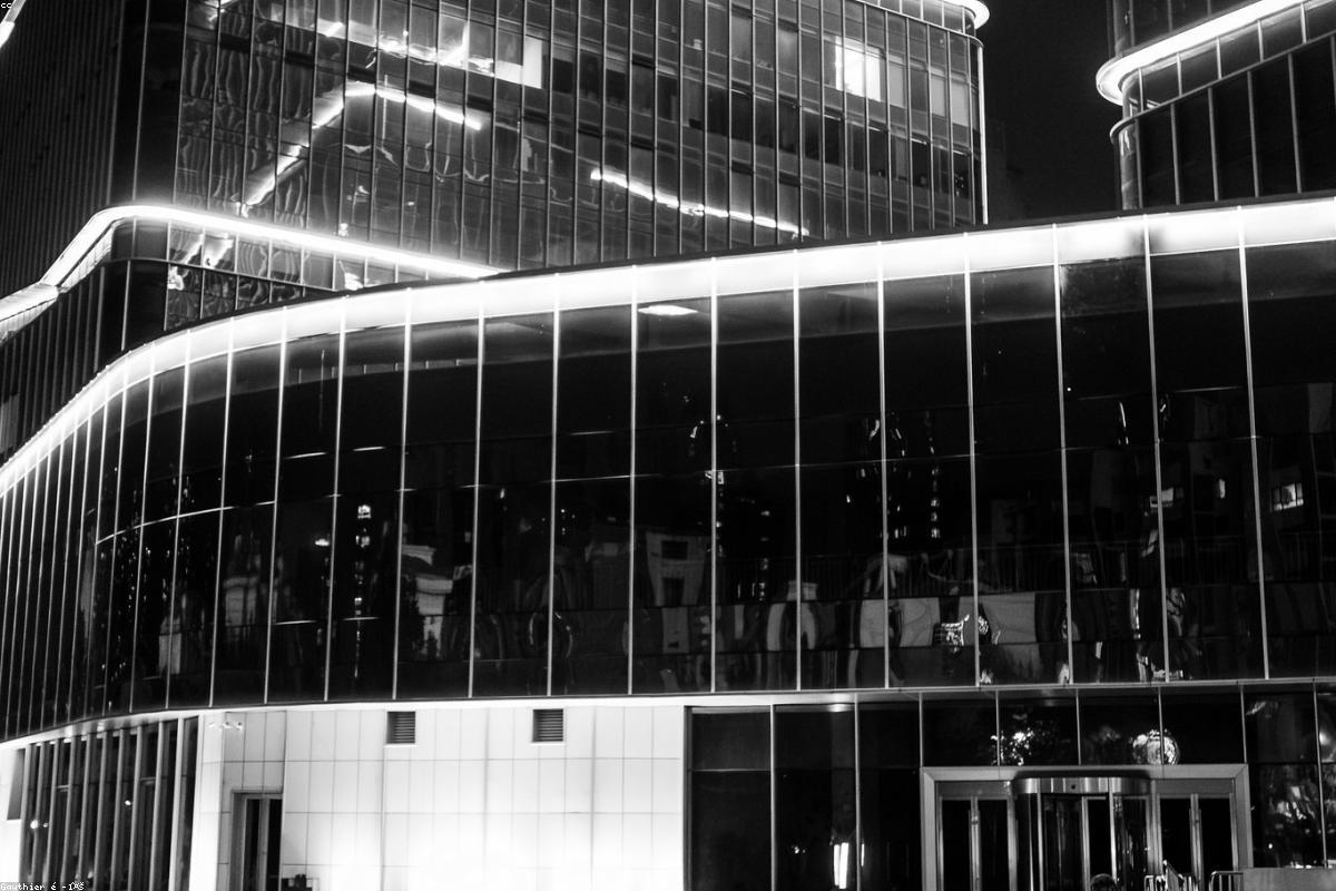
A screenplay is almost heartlessly economical about place. A scene might open with three words, “INT. DINER, NIGHT,” and leave everything else to be invented. Somebody has to turn that fragment into a real room with a real history, a place that looks as if people have eaten, argued, and grown old in it long before the camera arrived. That job belongs to the production designer and the art department, and their work is one of the largest, most underappreciated bridges between script and screen.
Production design begins with reading, not building. The designer combs the script for every clue about who the characters are and how they live, then asks the questions the writer left open. What year is it? What is the weather doing? Is this diner thriving or dying? Is it clean because someone is proud of it or clean because someone is anxious? The answers are rarely stated outright, so the designer infers them from the story’s emotional logic and then makes them physical.
The result is a set of governing decisions that ripple through hundreds of smaller ones. A single choice, that the diner is a fading family business clinging to a highway that traffic abandoned years ago, dictates the faded menu boards, the sun-bleached upholstery repaired with tape, the outdated calendar nobody bothered to change. None of that is in the script. All of it tells the story.
Believable spaces are almost always built on research. Before designing a period apartment, a police station, or a spacecraft cockpit, the art department gathers photographs, floor plans, catalogs, and firsthand references until they understand how such a place is really put together. This matters because audiences carry an enormous, mostly unconscious sense of what real spaces feel like. They cannot tell you the correct height of a 1970s kitchen counter, but they will feel it when something is wrong.
The goal of research is not slavish accuracy for its own sake. It is credibility. A designer studies real hospitals not to reproduce one exactly but to earn the right to bend the truth where the story needs it, widening a corridor so the camera can move, or heightening a color so the room reads on screen. You have to know the rules thoroughly before you can break them without the audience noticing.
Long before an actor speaks, the palette of a space is shaping how the audience feels. A production designer thinks about color the way a composer thinks about key. A home rendered in warm ambers and worn wood invites us in; the same floor plan rendered in cold grays and hard surfaces holds us at arm’s length. These choices are coordinated across an entire film so that spaces speak to one another, a character’s warm childhood home answering, scene by scene, the sterile office they end up trapped in.
Texture carries just as much weight as color. Peeling paint, water stains, scuffed floors, and fingerprints on a light switch are the vocabulary of a lived-in world. Their absence is equally expressive. A room with no wear, no clutter, and no evidence of habit reads as cold, controlled, or unreal, which is exactly what a designer wants for a character who is hiding something or clinging to order. Nothing in these surfaces is accidental. Every scuff was decided.
Within the built space, the set decorator handles everything the characters would own and touch, the dishes in the sink, the books on the shelf, the magnets on the refrigerator. This is where a character’s biography gets written without a line of dialogue. The contents of a bathroom cabinet can reveal an illness the story has not yet mentioned. The photographs on a mantel can imply a marriage that ended years ago. A careful decorator plants these details knowing most will never be consciously noticed, yet together they create the density that makes a place feel true.
One of the earliest strategic decisions is whether to build a set on a stage or shoot in a real location. Each has hard tradeoffs. A built set gives total control, walls that can be removed for the camera, lighting rigged into the ceiling, and no neighbors or weather to fight, but it is expensive and can feel artificial if the craft slips. A real location arrives with instant authenticity and texture no budget can fake, but it is cramped, inflexible, and full of practical headaches.
Often the two are blended. A production might shoot the exterior and entryway of a real building, then recreate its interior as a set where the camera can move freely, matching the two so seamlessly that audiences never suspect they have traveled between a street in one city and a soundstage in another. The illusion of a single continuous place is itself a designed achievement.
Finally, a production designer works not for the room but for the frame. There is no reward for detail the camera never captures, and no forgiveness for a flaw it happens to catch. The art department studies the shot list and the blocking to learn exactly what will be seen, then concentrates its effort and budget there. A wall that never appears on camera may be left bare; a corner featured in a long, lingering closeup may take days to age and dress.
This is the discipline that separates set design from interior decoration. The designer is not making a beautiful room; they are making a believable image that serves a story. When it works, the audience forgets that anyone designed anything at all. They simply believe, for two hours, that this diner has always stood beside this highway, waiting for someone to walk through its door.

By the time footage reaches the edit, the script has been written, the actors have performed, and the cameras have captured far more material than any film could use. What remains is the quiet, obsessive work of deciding what the audience actually sees and, just as importantly, when to move from one image to the next. Editing is often called the final rewrite, and the phrase is exact. A scene’s meaning, pace, and emotional force are settled here, frame by frame, in a room most viewers never think about.
At its most basic, an edit is a decision to end one shot and begin another. That sounds mechanical, but every cut is really a statement about time and attention. To cut is to say: you have seen enough of this, now look here instead. Hold a shot a beat too long and the scene sags; cut a beat too early and the audience feels yanked away before they were ready. The editor is constantly reading an invisible clock, the one ticking inside the viewer, and trying to cut on the exact frame where curiosity tips over into satisfaction.
This is why two editors handed identical footage will produce noticeably different scenes. The raw material is fixed, but the timing is a performance in itself. Where one editor lets a silence breathe, another slices it short to keep the tension coiled. Neither is objectively right. Both are shaping how time feels.
Every scene has a rhythm, a felt pulse underneath the images, and finding it is the editor’s central task. A frantic chase and a tender confession call for opposite rhythms, and the length of each shot is the primary instrument. Short shots in quick succession accelerate the heartbeat; long, unbroken shots slow it down and let emotion accumulate. Skilled editors modulate this pulse the way a musician controls tempo, speeding up as a scene builds and easing off to let a key moment land.
The trap for beginners is cutting to a mechanical beat, changing shots at a steady interval regardless of content. That produces something technically smooth and emotionally dead. Real rhythm follows the drama, not a metronome. A cut lands well when it arrives on a genuine beat in the scene, a decision, a reaction, a shift in power, rather than simply because a shot has run long enough.
Most editing is designed to be invisible, and the workhorse technique behind that invisibility is the match on action. When a character reaches for a door, the editor cuts to a new angle partway through the motion, so the movement carries across the cut and the eye follows the action instead of noticing the join. Done well, the audience never registers that the image changed at all. Their attention was riding on the gesture, and the gesture never stopped.
This kind of continuity editing is a set of learned conventions, matching eyelines so two people appear to look at each other, preserving screen direction so a character walking left keeps walking left, keeping props and positions consistent from one angle to the next. When these rules hold, a scene assembled from a dozen separate takes shot over many hours feels like one seamless, continuous event. When they break, the audience feels a jolt they usually cannot explain.
Some of the most important editing decisions are about restraint, specifically the choice of when to cut away from the person speaking to the person listening. The reaction shot is one of the editor’s sharpest tools. Often the truth of a scene lives not in the face delivering a line but in the face receiving it. Cutting to a listener at the right instant can turn ordinary dialogue into something devastating, because it shows us the words landing.
Editing is never only visual. Some of the most elegant transitions are built with sound, where the audio from the next scene begins before the picture arrives, or the sound of the current scene lingers over the first images of the next. These overlaps, often called J and L cuts, soften the seams between scenes and pull the audience forward. We hear the ocean a moment before we see the beach, and the transition feels like a thought rather than a splice.
Sound also governs rhythm inside a scene. An editor cutting a conversation listens as much as watches, letting the natural music of speech, its pauses, overlaps, and breaths, guide where the picture changes. Cutting on a breath or between phrases feels organic; cutting across the middle of a word feels wrong even when the picture matches perfectly. The ear is often a better editor than the eye.
What makes all of this remarkable is that the finished scene never existed. It was assembled from fragments captured out of order, a wide shot from the morning, a closeup from the afternoon, a reaction filmed on an entirely different day. The editor’s craft is to fuse these pieces so completely that the audience experiences them as a single lived moment unfolding in real time. The seams vanish, the rhythm feels inevitable, and the story appears to simply happen. That inevitability is the illusion. Behind it sits a person in a dark room, watching the same three seconds a hundred times, hunting for the exact frame where the scene finally comes alive.
You have written a short film and you want to shoot it without a large budget or a big crew. The good news is that low-budget production has never been more achievable. The catch is that limited resources punish poor planning. Preparation is the cheapest tool you have, so spend it freely.
Detailed guidance on this topic is also available via phukienlinrui.com.
Break your script down scene by scene and list everything each one needs: location, cast, props, time of day. This document, often called a breakdown, turns a vague ambition into a checklist. It also reveals problems early, while they are still cheap to fix. If a scene needs a location you cannot get, you want to know now, not on the morning of the shoot.
Audiences forgive a slightly rough image far more readily than bad sound. A modest microphone placed close to your actors will do more for your film than an expensive lens. Record a few seconds of room tone at every location so your editor has something to smooth the gaps.
A small crew works best when everyone is fed, warm and clear on the plan. Share the schedule in advance, keep call times honest and thank people often. The goodwill you build on a no-budget shoot is what brings the same people back for your next one.
Constraints are not the enemy of good work. Some of the most memorable short films were made with almost nothing but a clear idea and careful planning. Plan well, and your limits become a style rather than a setback.
Dialogue is the part of a script readers notice first and writers fix last. Good dialogue does more than carry information; it reveals character, builds rhythm and keeps a reader turning pages. Bad dialogue stops them cold. Here are the habits that separate lines that sing from lines that sink.
In life, we hint, deflect and talk around the thing we actually want. Scripts that ignore this feel flat because every character announces their feelings out loud. Let your characters protect themselves. The gap between what someone says and what they want is where tension lives.
If you can swap the names on two characters’ lines and notice no difference, the voices are not distinct enough. Vary rhythm, vocabulary and the length of sentences. One character might speak in clipped fragments while another rambles. These small choices let a reader know who is talking before they reach the name.
A well-placed pause can hit harder than a paragraph. When a character chooses not to answer, the audience leans in. Do not be afraid of white space on the page; it is part of the music.
Strong dialogue is rewritten, not improvised onto the page in one go. Get the scene working first, then pass through line by line, asking whether each one earns its place. The lines that survive that pruning are usually the ones an actor will thank you for.

Every screenplay you will ever read shares a hidden skeleton. Beneath the dialogue and the description sits a structure that decides where attention lands, when tension rises, and how a reader feels when they reach the final page. Learning to see that skeleton is the single most useful habit a new writer can build, because once you can see it in other people’s work you can start to control it in your own.
A common mistake is to begin by writing individual scenes and hoping they add up to a story. They rarely do. The stronger approach is to first agree with yourself on the spine of the film: who wants something, what stands in their way, and what they are willing to risk to get it. If you can say that in two sentences, you have a spine. Everything else hangs from it.
Once the spine is clear, the major turning points usually reveal themselves. There is a moment that pushes the main character out of their ordinary world. There is a point of no return roughly a third of the way in. There is a low moment where everything they tried has failed. And there is a final confrontation where the question raised at the start is finally answered.
Writers often panic about act structure as if it were a set of rules handed down from on high. It is more useful to think of acts as containers that hold a certain kind of energy. The first act sets the stakes and the world. The second act is the long middle where the character struggles, learns and is tested. The third act pays off everything that came before.
The lengths are flexible. A taut thriller might race through its first act in ten minutes, while a slow character study lingers. What matters is not hitting a page number exactly, but making sure each container does its job before you move on.
With the structure in view, you can interrogate every scene. A scene that does not change something is usually a scene you can cut. Ask of each one: what is different by the end? Maybe a relationship shifts, maybe a secret is revealed, maybe a plan fails. If nothing changes, the story has stalled, and a reader will feel it even if they cannot name it.
Once you have a draft, read it the way an editor watches a rough cut: cold, fast and unsentimental. Editors do not care how long a moment took to write. They care whether it earns its place in the rhythm of the whole. Train yourself to read your own pages with the same detachment and you will find the soft spots much faster.
None of this is meant to flatten your instincts. The best films often bend or break the shape we have described, and they do so on purpose. The point of understanding structure is to give you a reliable place to stand. When you know where the load-bearing walls are, you can knock through them with confidence rather than by accident. Master the skeleton first, and the surprises you build on top of it will land all the harder.